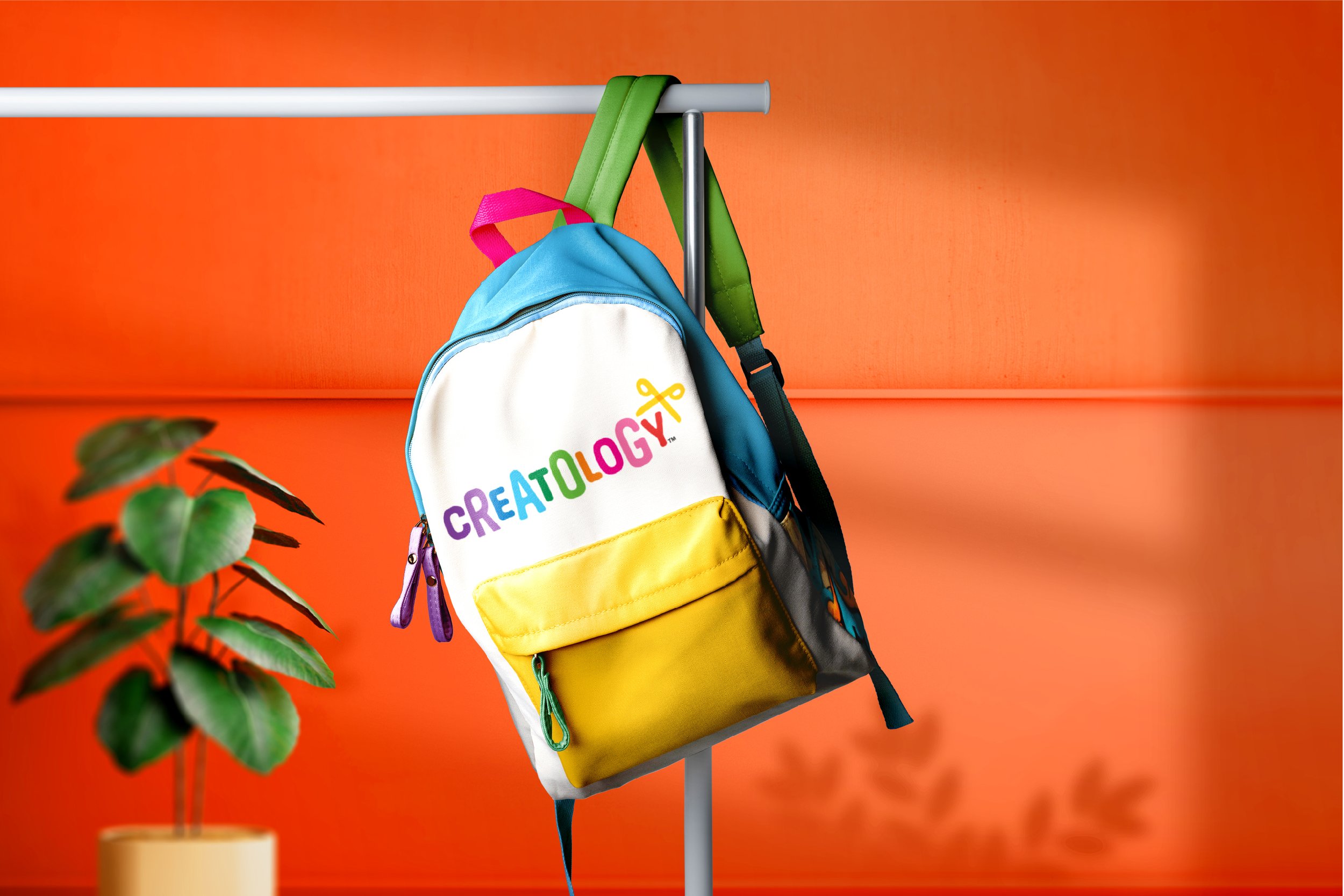
Branding & packaging design for Michael’s kids arts & crafts brand.
I was engaged by the Michael’s team to help reinvent their kids brand. My task was to elevate Creatology to compete with national brands while also reinvigorating the packaging with a fresh look and playful personality.
The current brandmark and packaging had become stagnant and cold. The spirited new identity delivers on the child-like energy of it’s target audience through the undulation of the typography and the spectrum of vibrant color. The packaging was designed to showcase the product through the lens of a child’s imagination.
The “doodle” pattern was created to represent the expansive range and variety of the Creatology product line - from paint and markers to beads and clay to stickers and ceramics - the possibilities are endless.
The playful spirit of the brand can now be felt across every application, inspiring kids everywhere to harness their imaginations and create, discover and explore.


