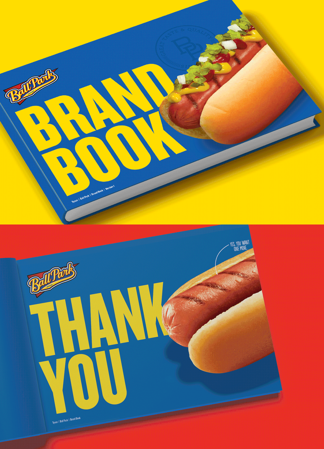
Guidelines for the brand born at the Ball Park.
I was engaged by Tyson to create a look and feel for the first-ever Ball Park brand guidelines. The design needed to deliver on the authentic taste of sumer and on the brand’s bold and playful personality.
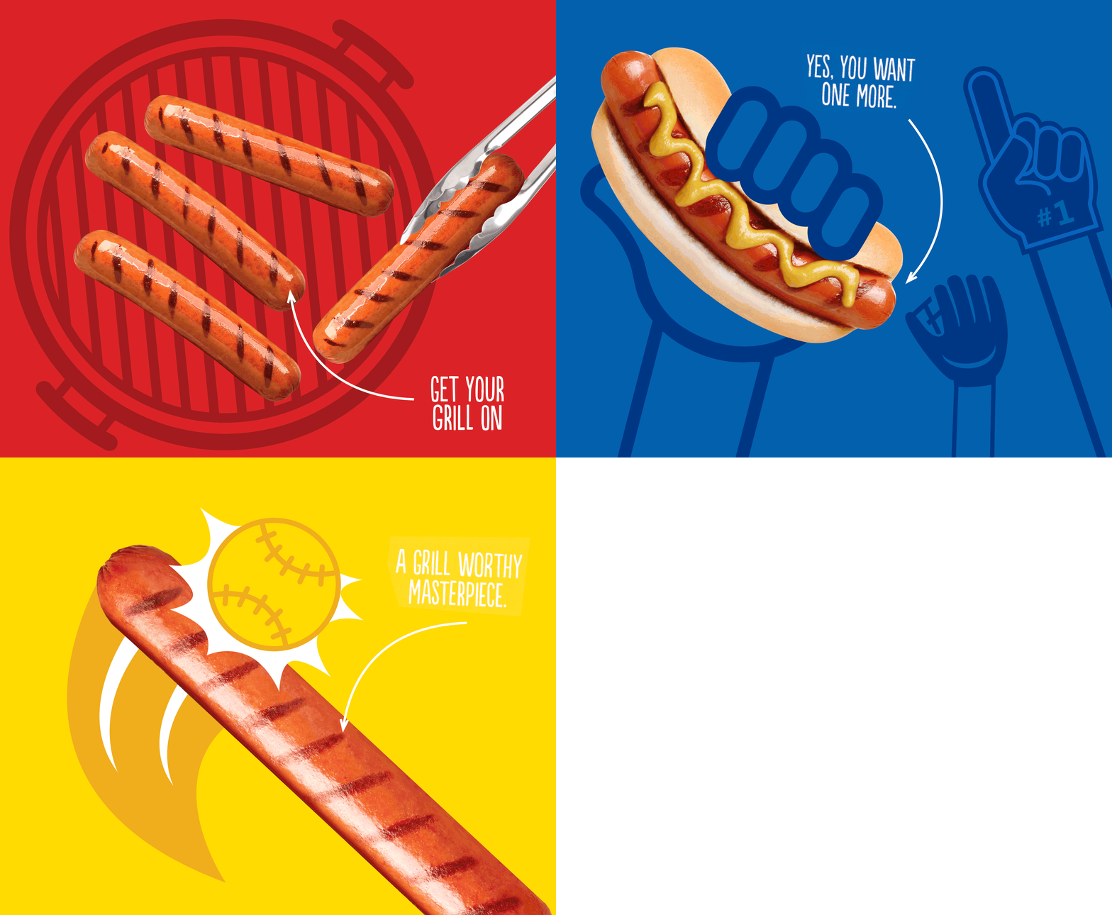
A combination of flat vector graphics combined with drool-worthy product photography and a flood of primary color created a playful balance that was undeniably Ball Park.
Since this was the first time a document like this had been created for the brand I helped the team outline the elements needed to be defined within the guidelines beyond basic color breakdowns and type styles - like brand positioning, narrative, attributes and consumer persona.
Since the tone of voice is genuine, laid back and always up for a good time - like the type of person you’d want to take to a ball game, I incorporated elements like jersey numbers and condiments on the contents page, ticket shaped text blocks and a logo usage page designed to look like a playbook that would inspire delight throughout.


